Moral Skin
An editorial storefront for a single hero product.
A skincare storefront built like a magazine: a split-screen display logotype, campaign photography at full bleed, and a product page that carries the science without losing the elegance.
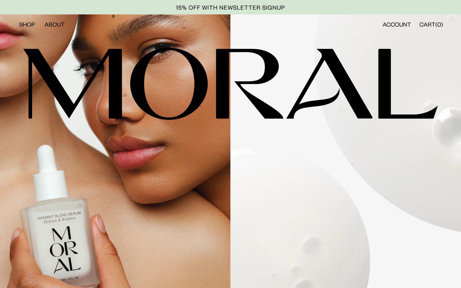
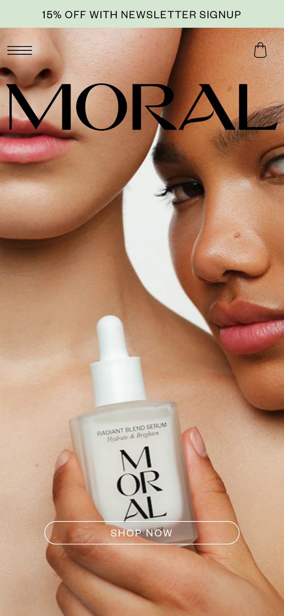
Homepage — logotype set across campaign photography and product still
- Typography
- Display serif logotype at cover scale
- Structure
- Split-screen hero, editorial product story
- Commerce
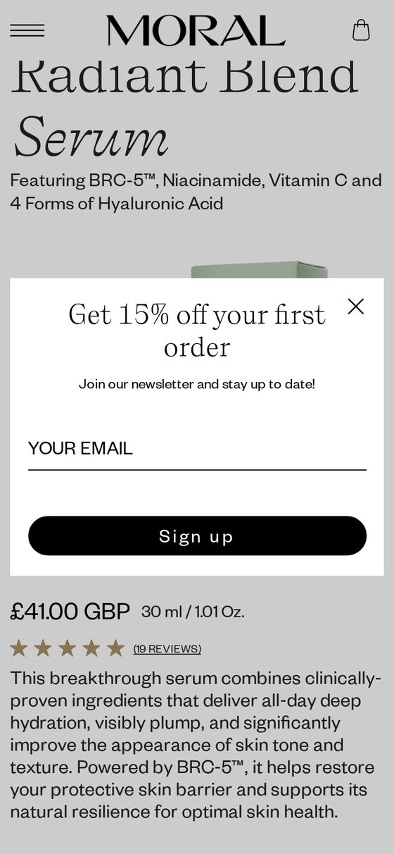
- Single-product funnel, reviews, newsletter offer
- Live
- moral-skin.com
Services
- Brand direction
- UI/UX Design
- E-commerce
- Web Development
Build
- Headless commerce
- Cart and checkout
- Editorial layout system
- Responsive imagery
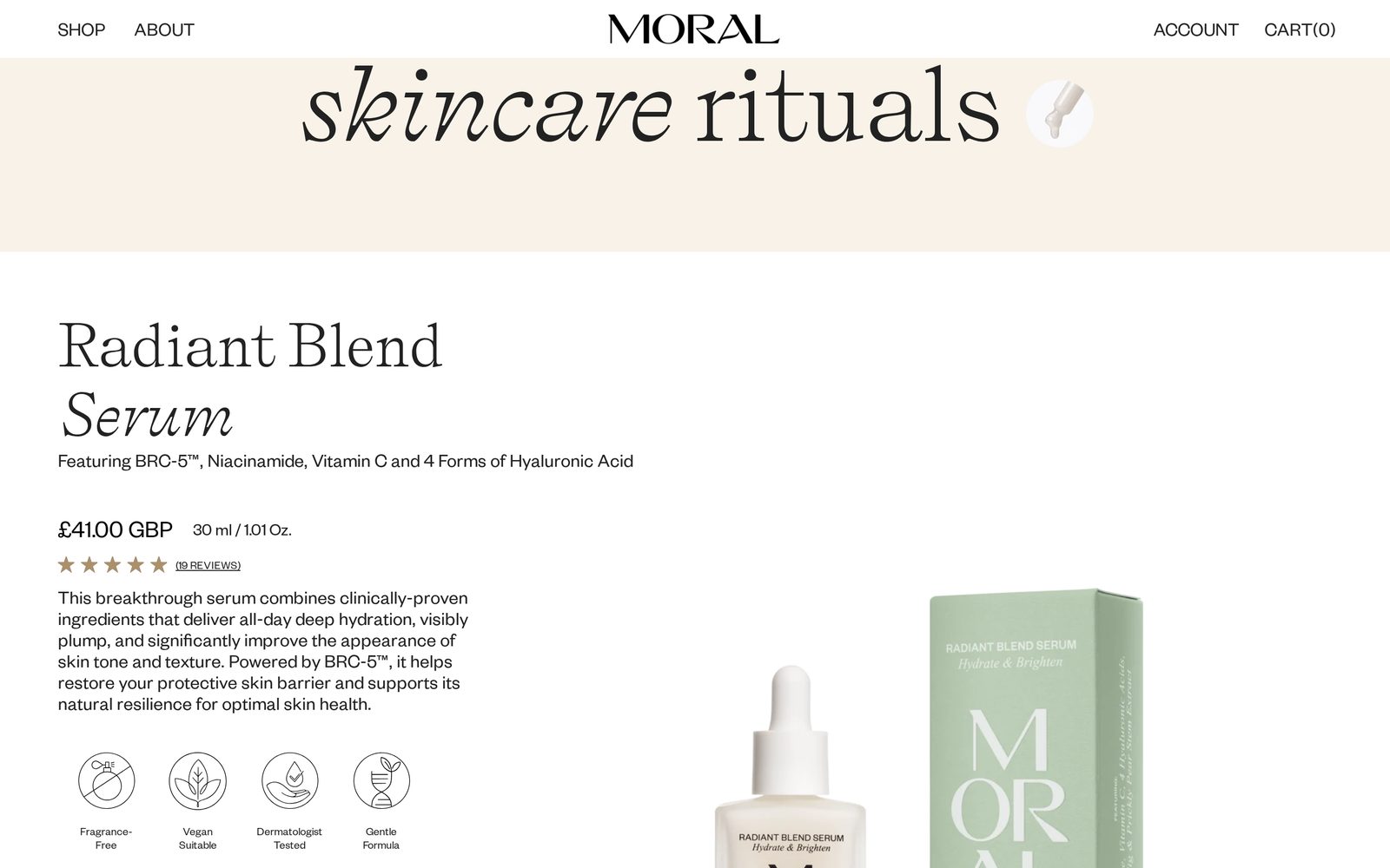
How the interface works.
With one hero product, the storefront has to behave like a cover. A high-contrast serif logotype is set across a split screen so photography and product share the first view, then the page moves from desire to evidence — ingredient story, formulation claims, reviews — before the buying decision. Restraint is the entire mechanism: two typefaces, near-white surfaces, one accent.
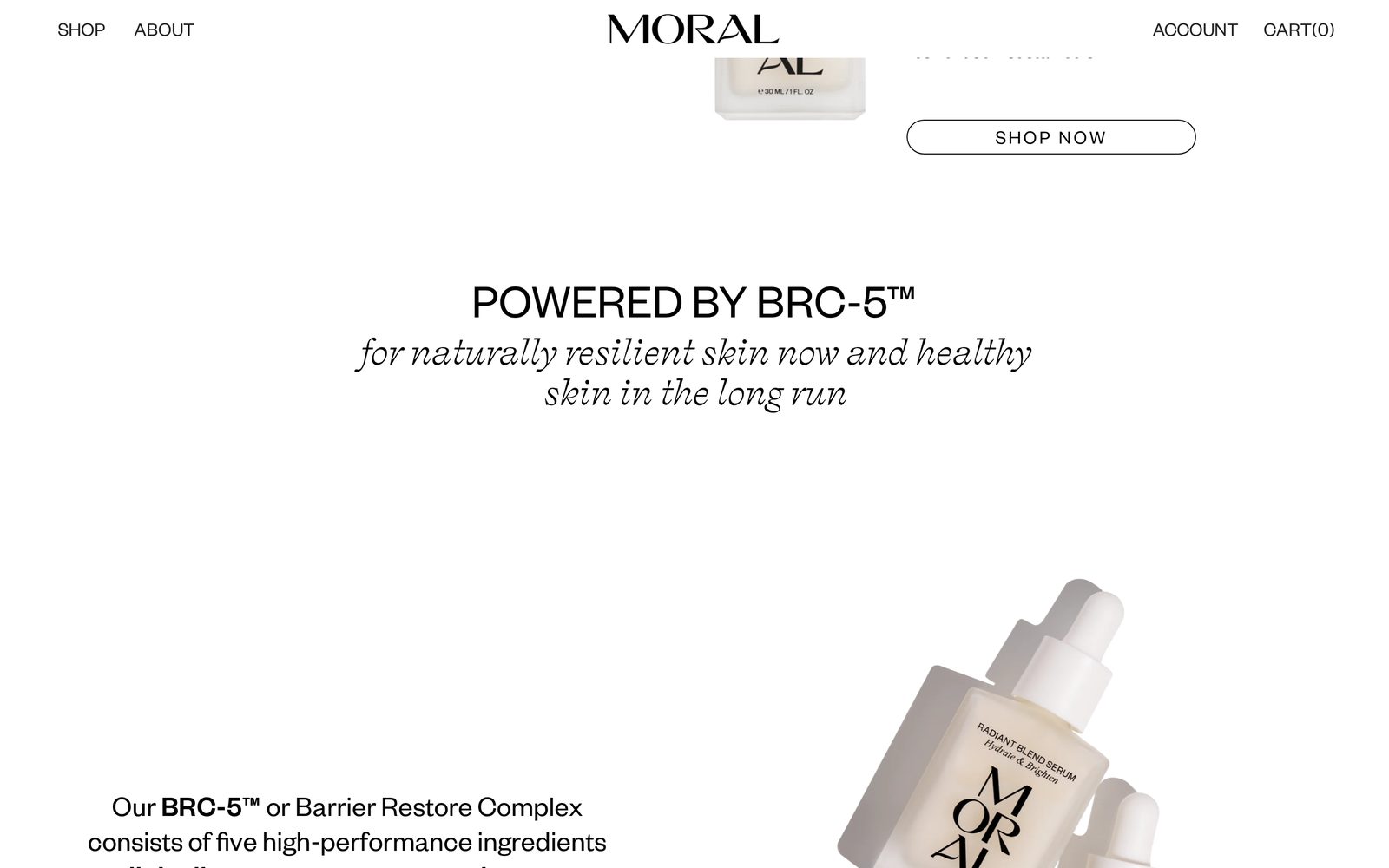
Desktop, tablet, phone.
The same interface captured at three widths from the live site — layout, type scale and navigation resolved for each.
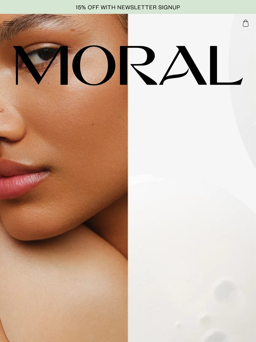
Built for the smallest screen too.
Want work documented like this?
Tell us what you're building and we'll come back with a clear direction, scope and timeline.